

Why we will abolish "Top Notifications"
26. Mär 2026
Everyone knows them: green bars that pop up at the top of the screen. "Successfully added to shopping cart", "Saved", "Action completed". For a long time, these top notifications or toasters were considered best practice. However, we have decided to systematically remove them from our architecture over the coming months.
Reading time: 3 minutes
Not out of a design whim, but because in practice they create more problems than they solve. Our decision to make this switch is based on three hard factors: user experience, accessibility and technical maintainability. In doing so, we are making a clear statement in the direction of the Barrierefreiheitsstärkungsgesetz (BFSG).
Well meant is not well done: The journey of the eyes
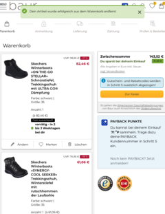
Let's imagine an everyday situation: A user scrolls all the way down and clicks on "Add to cart" in the footer. The action is completed, but the success message appears - far away - at the top of the screen.
What happens here is a classic UX error. According to the proximity principle, people expect related information to appear close together. Action and feedback belong together. If they are separated, the cognitive load increases.
Our plan: In future, we will place feedback where the action takes place - directly in context. Inline instead of globally. Our goal is a design without visual detours and without search movements for the eyes.
The final boss: focus management and accessibility
What is "only" irritating for sighted users quickly becomes a barrier for people with screen readers. Screen readers navigate pages linearly. If a message suddenly appears at the top, the browser focus would have to be actively shifted there for the information to be perceived at all. This is technically feasible, but extremely error-prone.
- The problem is that when the message disappears, the focus has to return to the original position. The slightest deviation leads to a loss of orientation.
- Our solution: By switching to inline feedback, we completely avoid this risk. The focus remains where the user is interacting anyway. No jumps, no surprises - and full WCAG compliance.

The time dilemma: auto-dismiss vs. WCAG
Top notifications bring with them a structural problem: time pressure. Many people expect notifications to disappear by themselves after a few seconds. At the same time, guidelines stipulate that content must be perceptible without time pressure (important for people with visual impairments or cognitive limitations).
Inline feedback will elegantly solve this dilemma in the course of our changeover: The information simply stops. It does not push, it does not stress. The next step is up to the person and not the timer. This feels more natural and is simply more accessible.
Less CSS Tetris, more clean architecture
In addition to UX and accessibility, there is a very tangible technical reason for our roadmap: Maintainability.Global notifications usually live in their own layer above the page. This inevitably leads to "Z-index wars": Modals, sticky headers and cookie banners all compete for the top level.
By integrating feedback as part of the normal page flow in future, we are cleaning up our codebase:
- No more complex overlays.
- No more special logic for focus jumps.
- A clean, long-term maintainable standard for all our components.
Conclusion: progress through renunciation
We are not planning to abolish top notifications because we can't build them - but because we no longer need them for a modern, inclusive web architecture.
True user experience is not created through as many effects as possible, but through clarity and respect for different usage scenarios. Switching to inline feedback is the logical next step for us: closer to the action, more robust in terms of technology and ready for the requirements of tomorrow.
Accessibility is not an add-on, but a quality feature. And sometimes progress means letting go of things that have long been taken for granted.
